Overview - A Productivity App using Secondary Screen Technology
Over the last few years, we have seen a greater focus on self-development driven by social platforms. Intuitive products, such as ToDoIst, or FitBit have been created. We've also seen a rise in secondary screen devices and personal hubs, that are elevating our experiences with existing technology and live in the periphery of our day to day life.
These tools not only encourage organisation but also provide data to inform self-analysis and progression. Based on my curiosity to understand what drives an individual’s productivity levels, I explored what requirements would be needed to design an innovative productivity app, that leverages the use of second-screen technology.
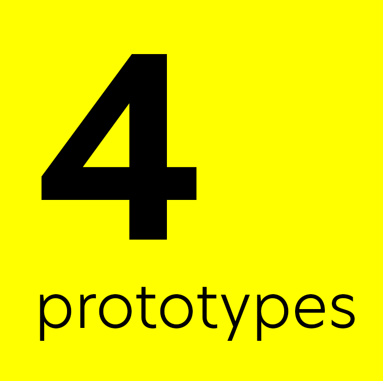
This study followed a user-centred design approach, where I tested 4 iterative prototypes exploring various themes including factors for motivation, gamification as well as IoT devices.
Context
This study was undertaken as part of my final year project at Lancaster University, studying Computer Science with Design. It was a self-directed 6-month endeavour with some minimal supervision, where I wanted to apply my existing UX knowledge and discover a new range of best practices through my reading into methodologies and research techniques.

Double Diamond Design Process
Background Reading
Psychological Theories - One way of exploring how and why people may organise, plan, or use a specific app or method is to consider the psychology that can affect their decision-making. Much of this was geared towards motivation, goal attainment and patterns of thought that can impact a user's long-term success in their tasks.
Peter Gollwitzer Implementation intentions theory played a big part in my design decision-making (ironically). Mr Gollowitzer's study hypothesised that those who established a thorough intention to implement were more likely to achieve their goal (62% success rate) than those who set vague goals or aspirations (23% success rate).
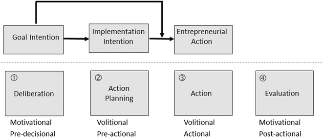
Gollowitzers Implementation Theory
Gamification - Throughout my background reading, I constantly found two underlying factors, intrinsic and extrinsic motivation. It was clear that whilst intrinsic motivation is the true determiner of success for most, it is a fluctuating commodity, and it was important to consider methods of reigniting extrinsic motivation to ensure users can maintain long term retention and reach their goals. Gamification was one method I researched to help resolve this issue.
*It's important to note, that this research was not used to narrow down the ideation phase, but rather to open my understanding of the field and problem, and was in parallel with the interview and prototyping phases.
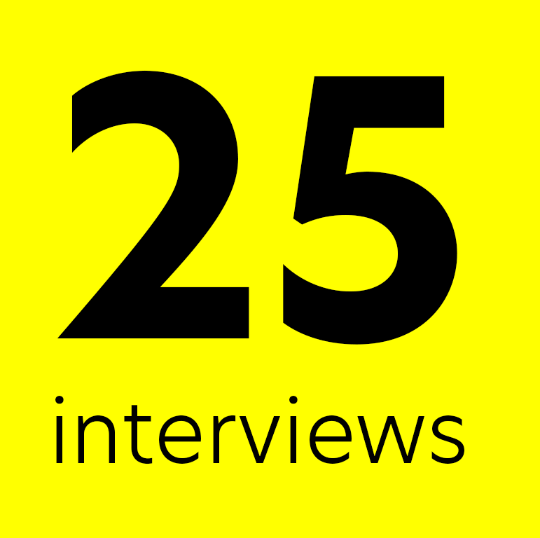
Initial Interviews
I conducted semi-structured interviews with both male and female participants between ages 18-55 years old. My goal was to understand more about their experience with organisational tools, smart devices as well as how they build habits and accomplish their goals. This helped define the initial user requirements for the platform.
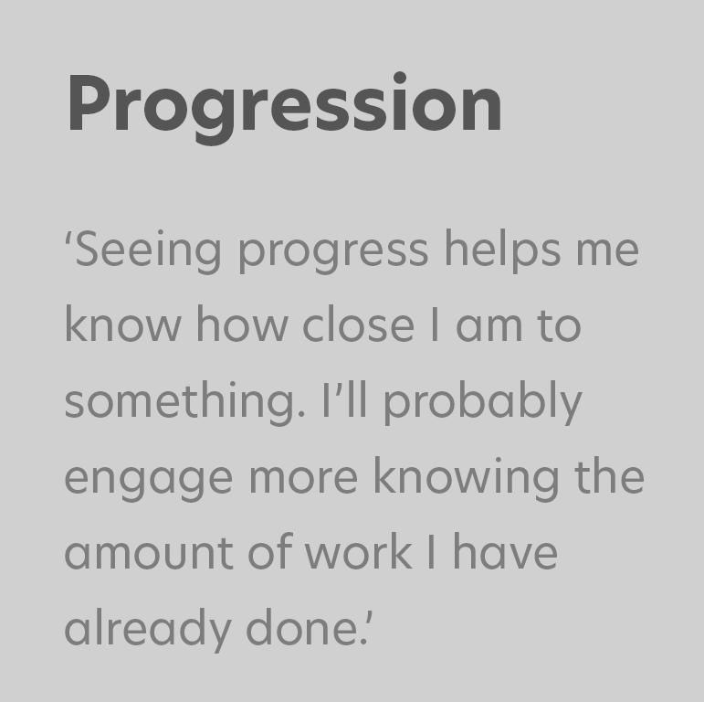
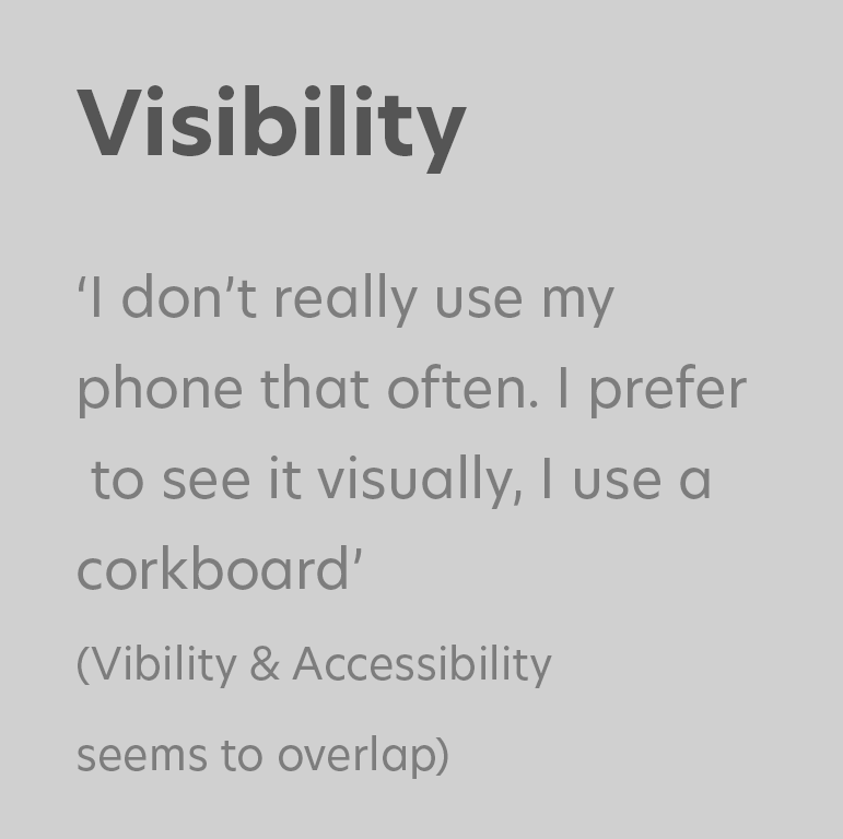
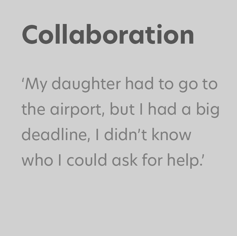
Results were coded using informed grounded theory, and an affinity diagram was created. Here are the main takeaways that I set as the core pillars of my design from the interview process.

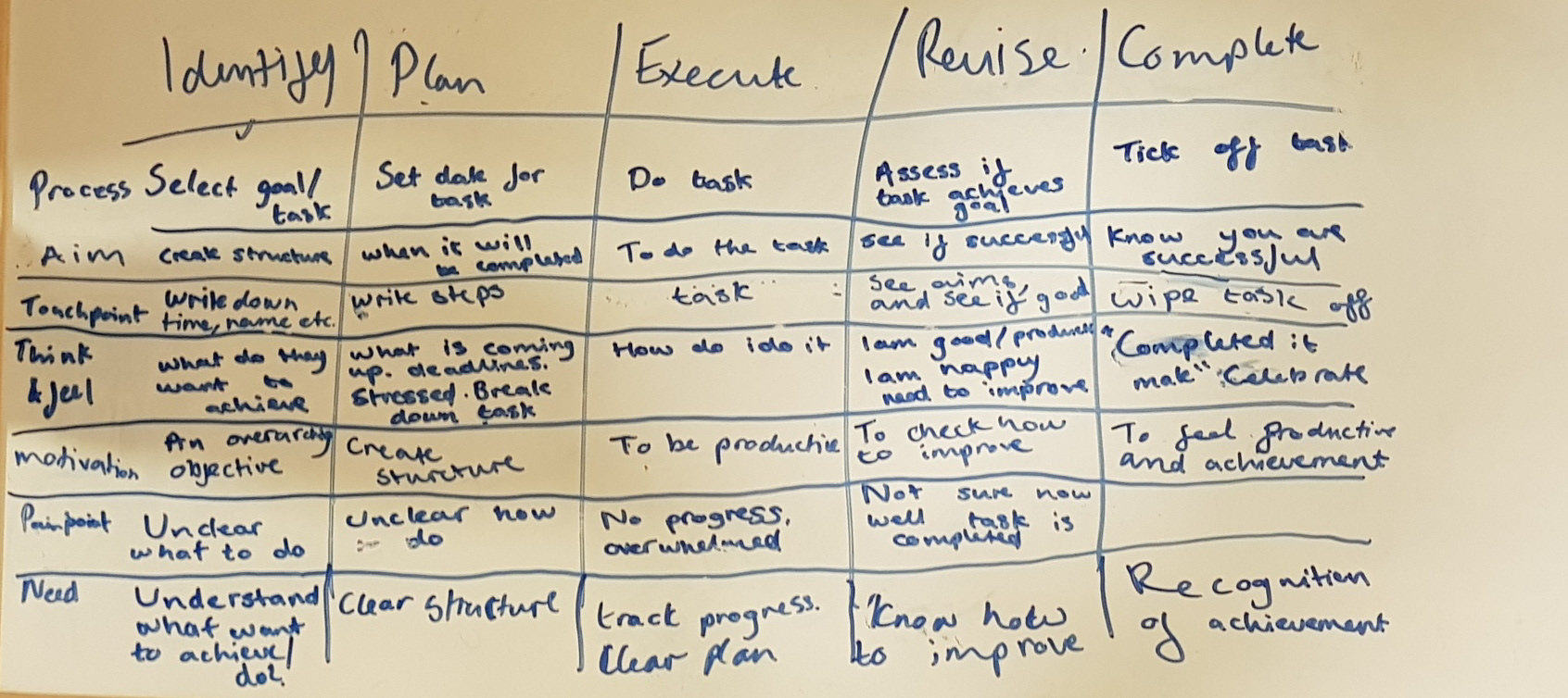
User Journey
User Personas
Informed throughout the insight of the interview sessions, I created 4 user personas to provide a reference who our target users are, and as well as their habits, hobbies and lifestyles. These helped inform decision making throughout, and allowed me to visualise real-life scenarios that they are likely to encounter and use the product. To ensure that findings during this stage were representative of real users, it was important that personas were not influenced by biases or stereotypes.


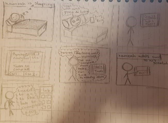
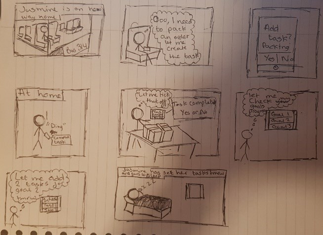
Storyboard
I storyboarded various applications of use for the application and its secondary screen. This helped build situational awareness of potential pitfalls that may affect the way users interact with a product in the day to day life. This helped me get acquainted with potential accessibility issues and considerations for temporal and long term disability. They also allowed me to communicate ideas to any potential stakeholders quickly.

User Story
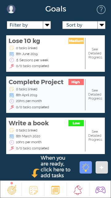
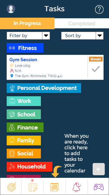
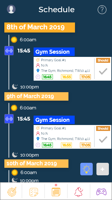
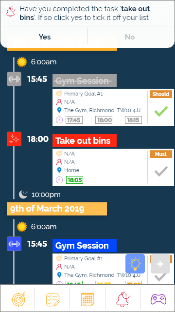
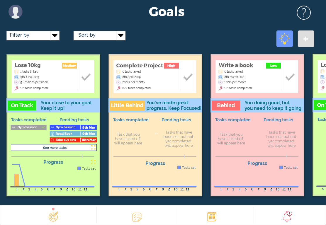
The user story helped identify key epics within the user journey from start to end. As you can see, three main sections have been identified; goals, tasks and schedule. These are used to satisfy Gollwitzer's implementation theory, where users must first set an overarching goal. They must then plan the tasks that will help them achieve that goal, before adding it to their schedule.

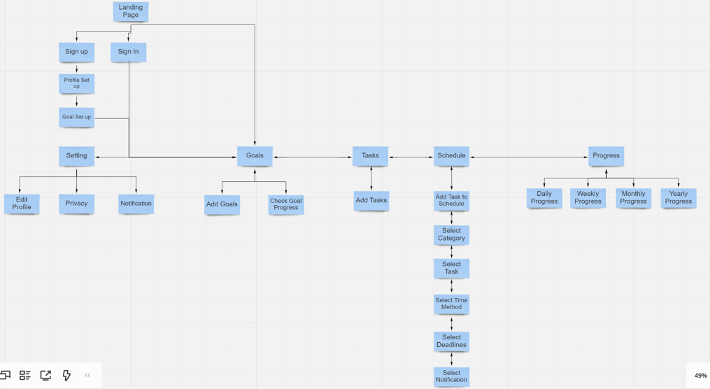
Site Map
Whilst the user story helped create a broad outline for the application information architecture, the sitemap helped to organise the information and understand how users can navigate from page to page, streamlining their experiences.
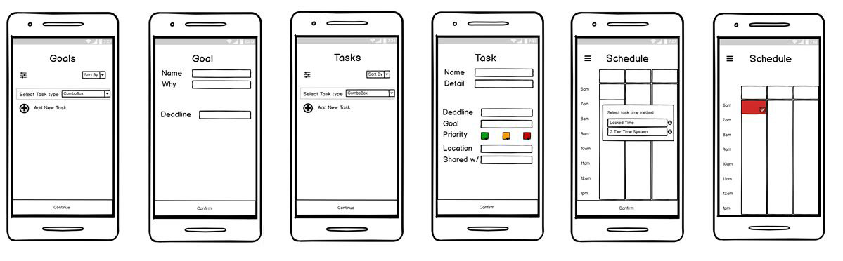
Wireframing
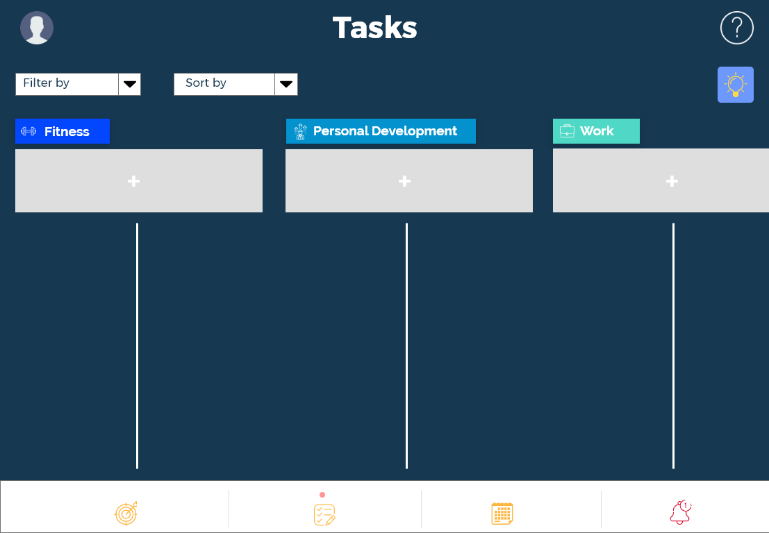
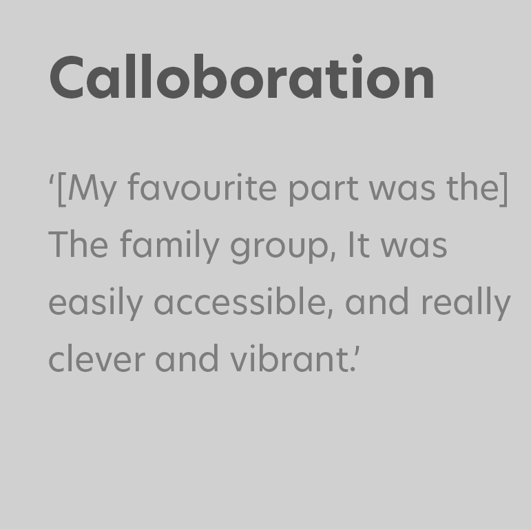
I created wireframes for both the mobile app and organisational hub screen. I had to ensure that the experience was synonymous but still unique for each device. This ensured that information was structured in a way to make most of the visual space available on each device whilst the navigation remained slick but recognisable across both designs.
Implementation Intention Journey:
Following the implementation theory, a user first sets their goals, then adds a task, assigning it to a specific goal, before slotting it into their schedule. One of the requirements based on interviews was to consider deadlines and times. In this process, I added 2 deadline options, one that is more intrusive and one that is not. This is an attempt at avoiding users becoming overwhelmed with too many incomplete tasks as a result of a busy day and provides more flexibility when needed. This was important as insight in the interview phase showed that most people don't get all their tasks complete that they set, or in the original time frame that they have wanted.

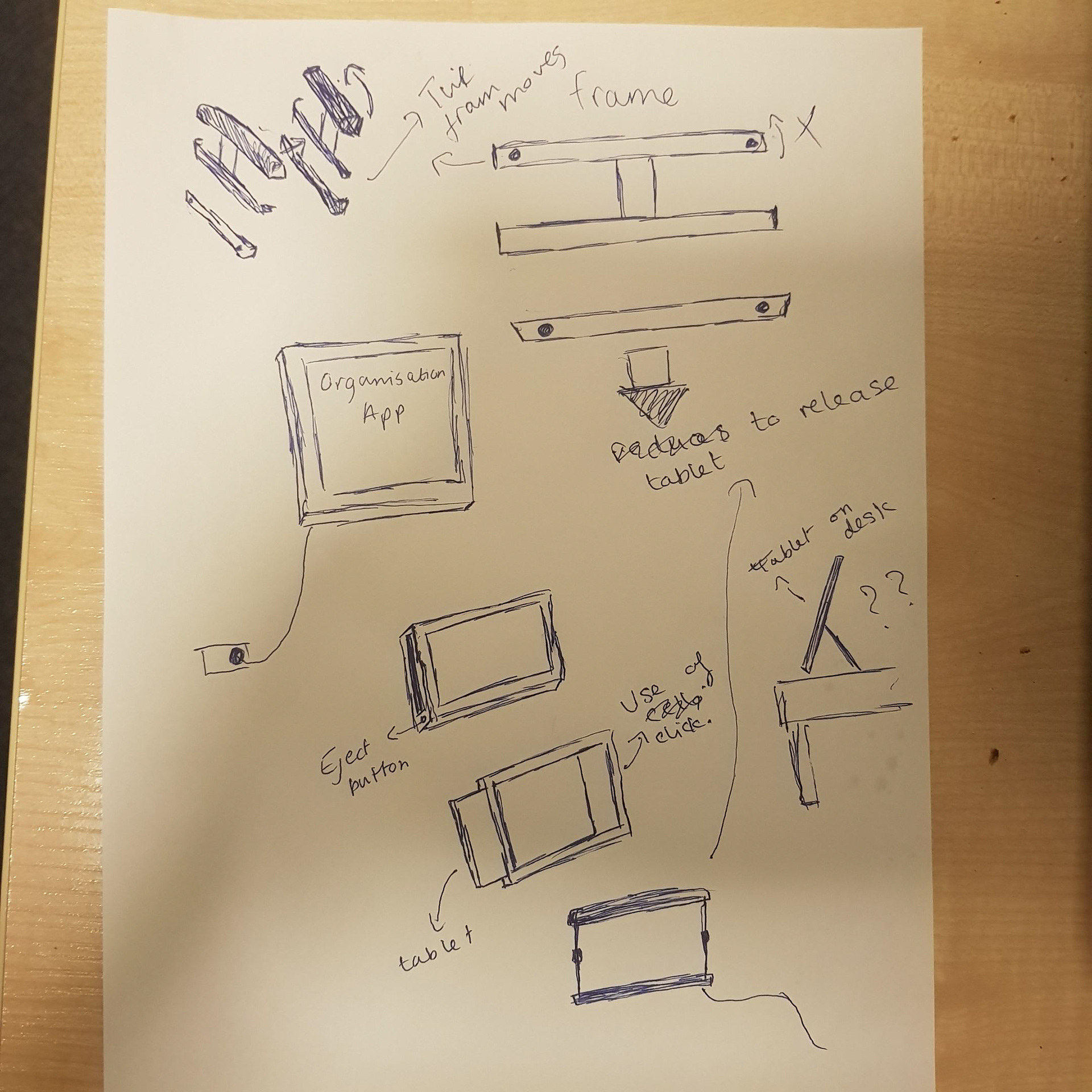
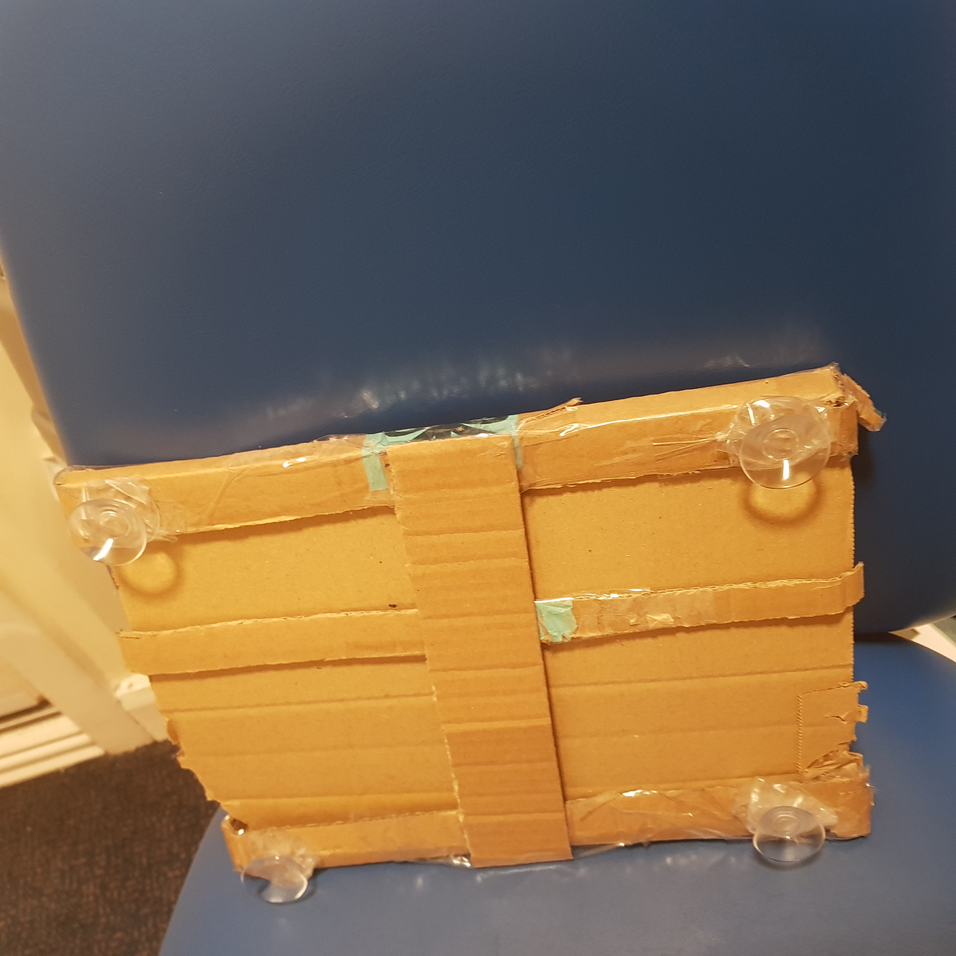
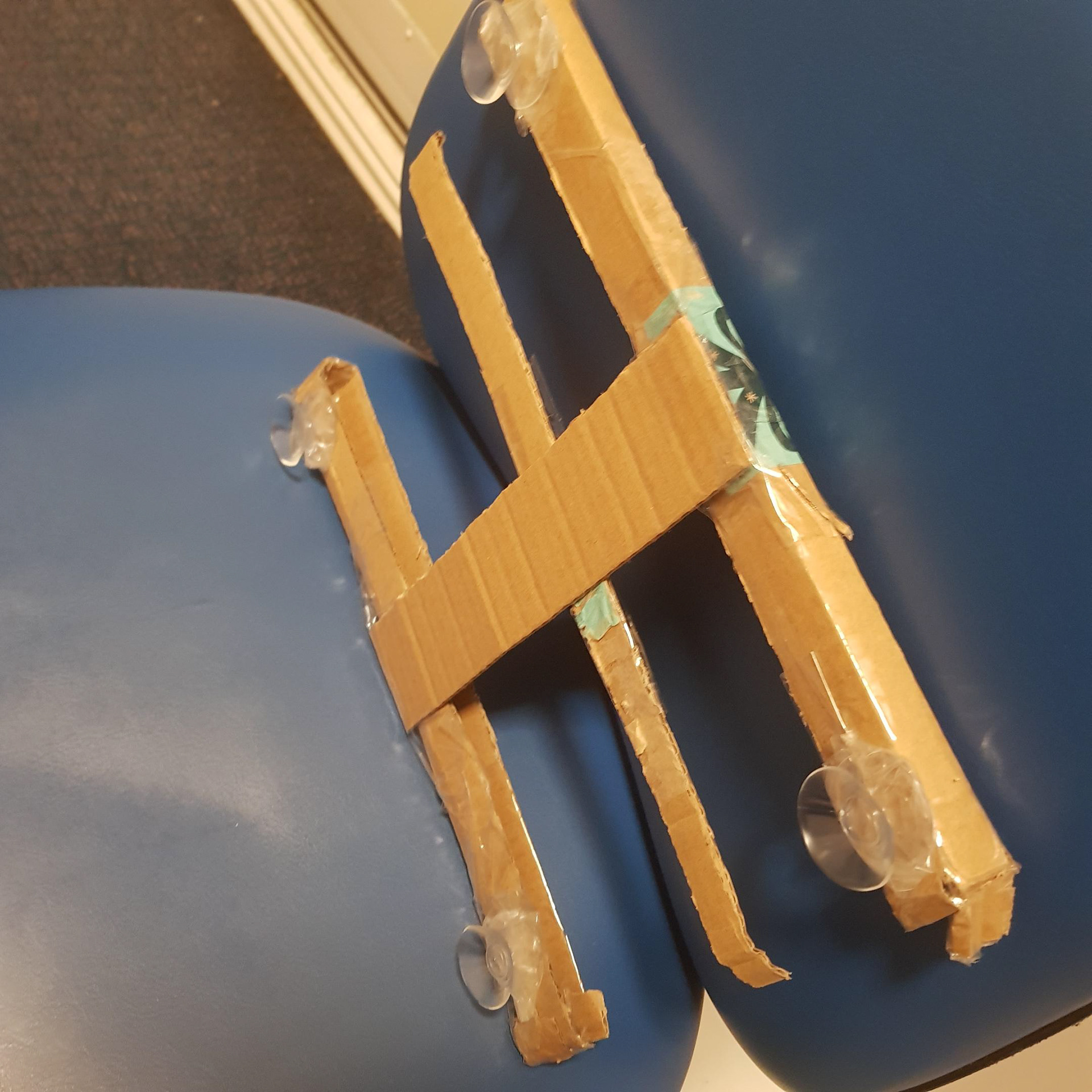
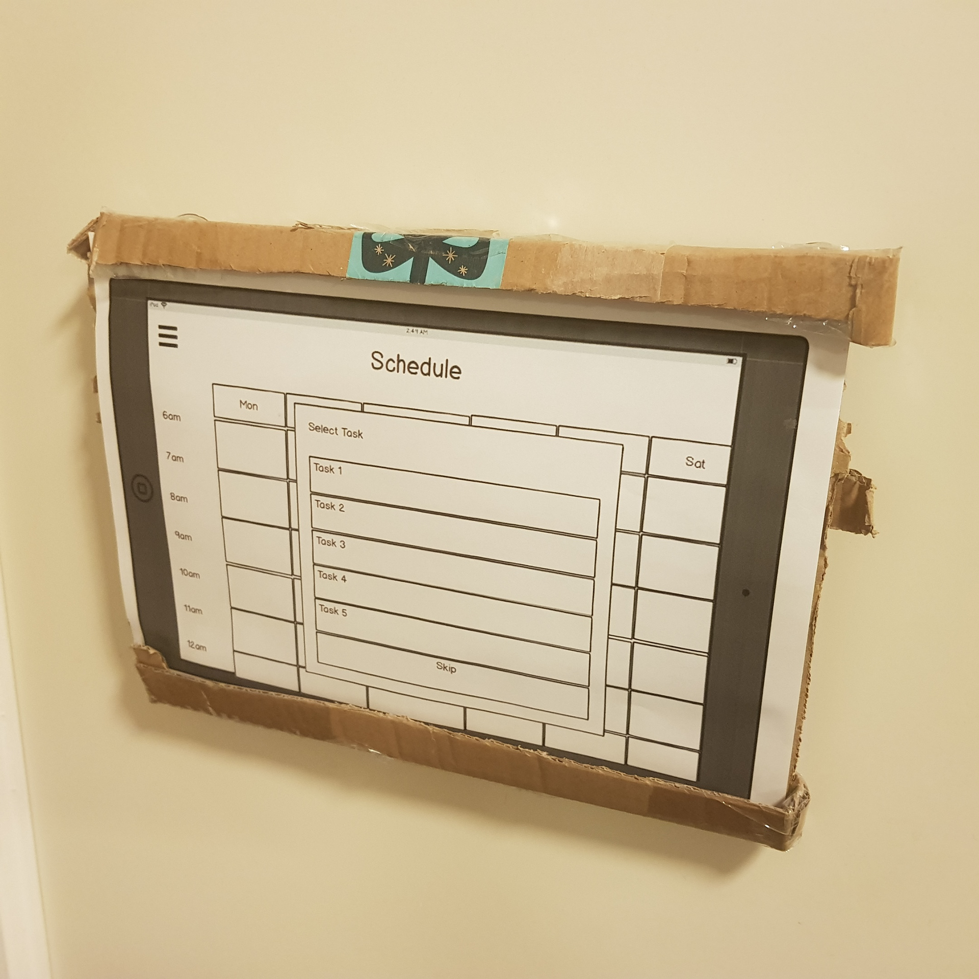
Rapid Cardboard Prototyping
One of the main design factors that I had to consider was how the organisational hub can be implemented in an office or home setting. I had to consider portability, charging/power, and ergonomics. I wanted to test out how users will interact with having the screen on a wall when managing their schedule, using suction cups. I also added slits to enable me to flick through screens in a Wizard of Oz user test.
Medium Fidelity Prototype
Based on insight from the initial wireframes I rapidly created some Medium Fidelity prototypes that have real-time interaction. I added colour as an extra communicator for the design, and readjusted the navigation bar, to be situated at the bottom of the screen.
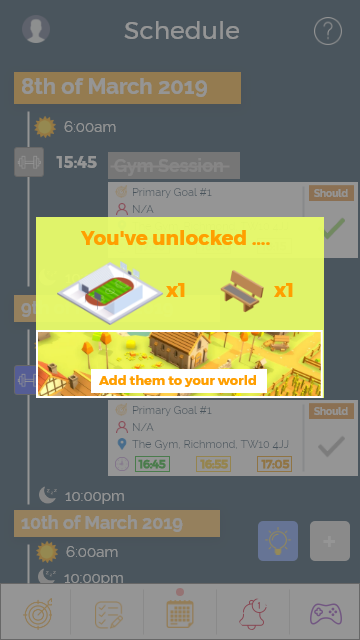
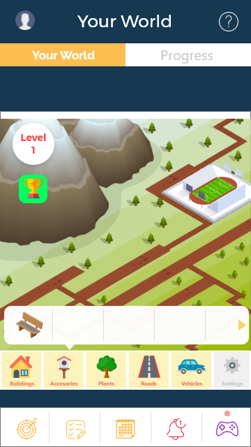
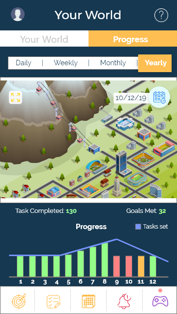
New features that I experimented with in this prototype is the rewards section for completing tasks, adding gamification by creating your own world to help increase intrinsic motivation, as well as an ideas section to help users who struggle with setting or identifying goals, which was an issue identified in previous interview sessions.


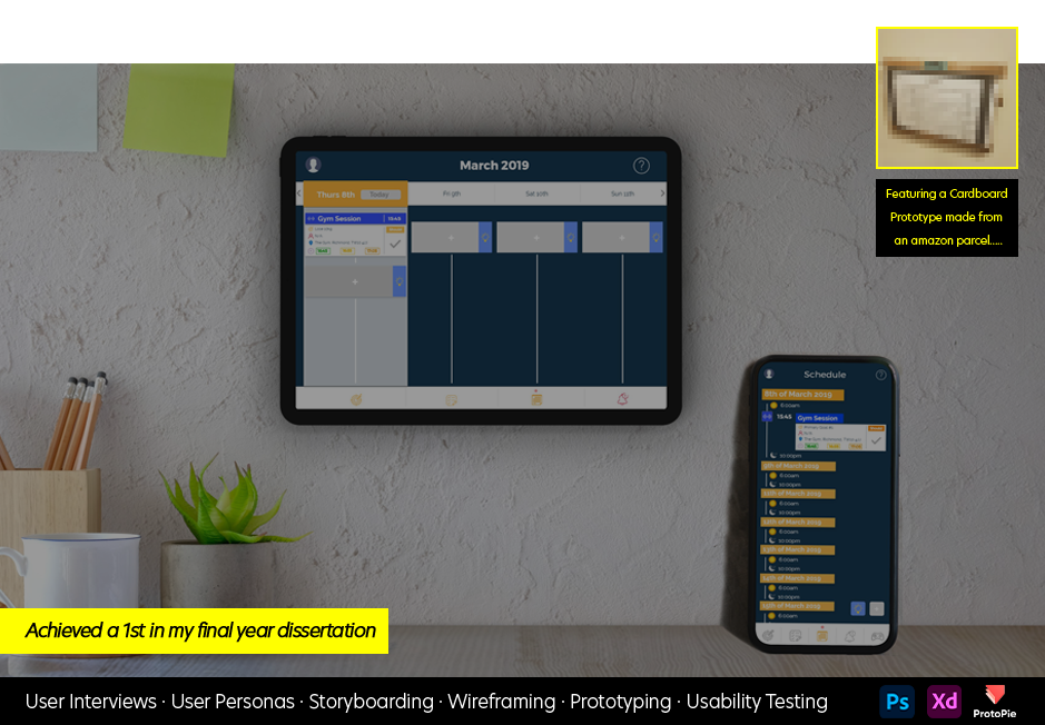
High Fidelity Prototype
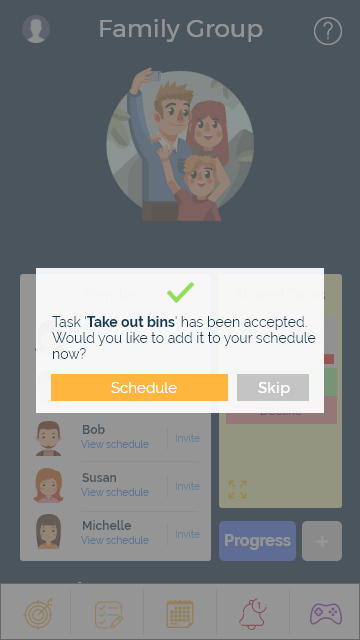
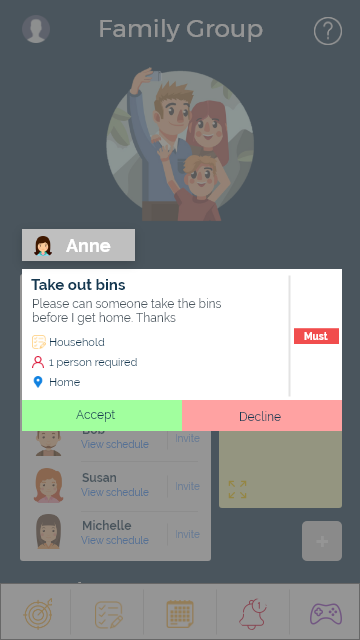
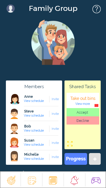
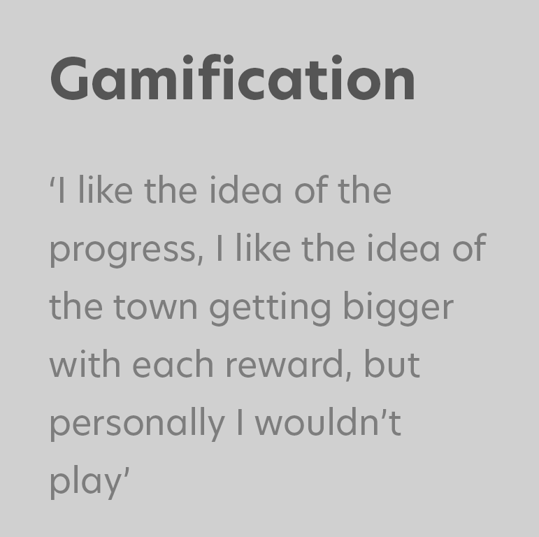
Using Protopie, I created a prototype that synced between both the mobile phone screen and the organisational hub. This allowed me to simulate a real-life interaction between the two devices. I also added further interaction in terms of the reward and gamification section so that I can complete more observation into how users may react to it. I added wording of could, should, and must for prioritising a task, helping creating written reinforcement when making decisions, and planning their day. I also felt it was an appropriate time to add a collaboration feature as identified in the initial interviews.

Testing
The testing focused primarily on analysing the usability of both the phone and the tablet. Participants where asked to think-alound whilst being observed, so that I could capture their thoughts and decision-making process.
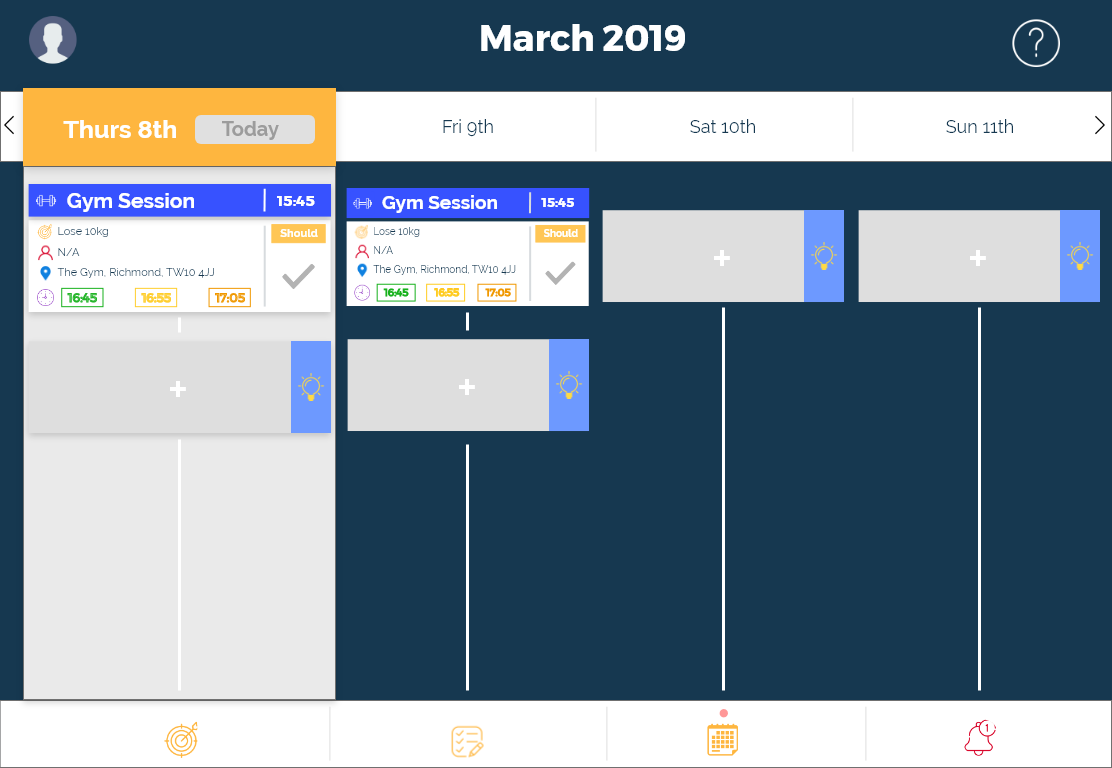
It was clear that users found the gamification aspect to be intriguing, with all users showing excitement at that screen. However during exit interviews, showed hesitation that it would attract them to use it long-term. 90% of participants also had trouble with identifying that they had to long-press on a tab for the options to appear. This would be something that I adjust in a future iteration.

The session concluded with users filling out a NASA TLX form to rank the apps usability:
Mental - 5
Physical - 1
Temporal - 1.9
Performance - 5.3
Effort - 4.67
Frustrations - 3.4
Overall the product is relatively sufficient in regards to usability. However, these results show that the application's overall experience provides heavy demand in effort, performance, mental, and frustration. This shows that further refinement is required to ensure that the app does not result in cognitive overload.
Analysis
It was very clear that people preferred one device over the other. This shows that both the organisational hub and the phone need to have clear identifiable reasons for use, otherwise it may cause abandonment in one or both devices, and the concept of second screen devices becomes obsolete.
Self-completion plays a big part in the user experience of productivity apps. If users are not ticking and completing tasks, then an app becomes redundant. It is important that input is sleek, there are shortcuts, and for reduced repetition and the feeling of manual data entry. This will help improve the experience for users.
Users ignore a large part of the instructions and information provided to support them with new processes. Despite providing text and imagery that explained the idea of Implementation Theory, 80% of users ignored or forgot about it once they had completed the study. This issue of familiarity and going into auto-pilot shows that to present new ideas you must first get the user to stop and think, through clever intuitive designs such as games, puzzles, or interactive sliders. Otherwise, users will default to what they expect and ignore new information.
Future Takeaways
As with any UCD study, many more studies are required for any of these concepts to truly be evaluated as successful or not. What I did find however was a lot of my initial findings matched both my assumptions and the hypothesis of similar studies and research.
I feel like this particular process of using implementation theory may work, but would require longitudinal studies analysing people's success rate over a period of 2 weeks or more (the usual bounce rate of productivity apps). A dairy study could be suitable to discover if people find the process time-consuming, or potentially does not provide promote enough extrinsic motivation for continued use. It will also allow us to see how people interact with secondary screen device in a natural setting.
People enjoyed the collaboration feature, so social implications of this are important aspects to consider. This could include social ladders, or potentially promote goal completion through social pressure. Further tests would be required to see how this would work in real-place scenarios, potentially creation group studies to see if people cheat themselves out of completing their goals, in hope of claiming rewards and showing that they have completed tasks, or if people stay true to themself, potentially social pressure plays no part at all in engagement. This would definitely be an interesting avenue to pursue in future iterations.
One thing I would ensure to do in future studies is to complete more interviews. Whilst using Neilsen's rule of 5 is enough for each testing and interview phase, this in hindsight is a little outdated and I should have used 5 interviews as a base number, and pursued more interviews, until I felt I had enough correlative patterns to base my ideas upon. I could have also created more vertical prototypes to really dig deep into how users may interact with a specific navigation flow or feature.