Pintu
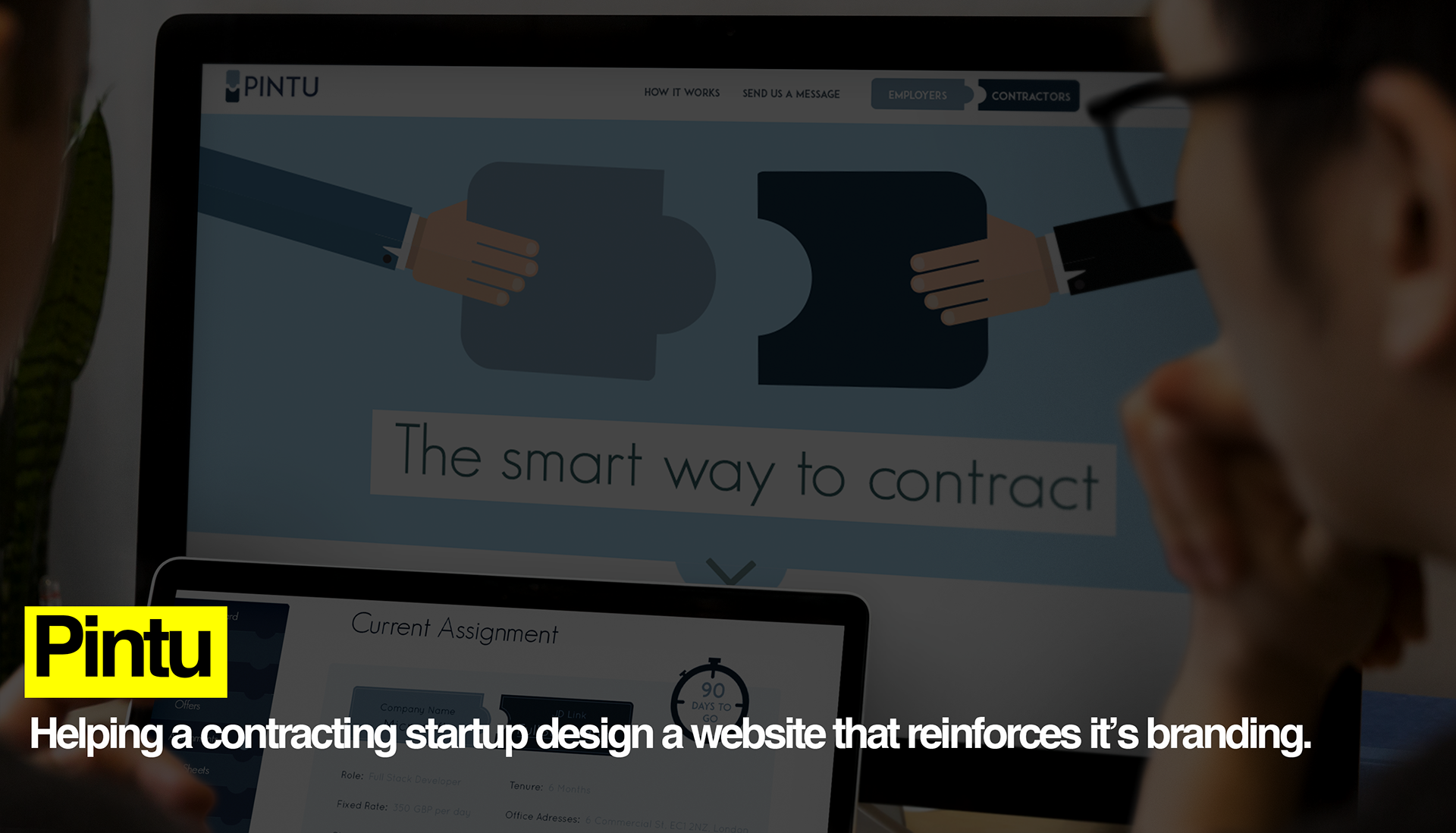
Pintu is a start-up that was looking to redefine how Contractors and Employers liaise and work together. It's CEO believed in a platform that was simple and brought the two parties together in a unique experience.
After working on a logo and branding (see below 1.1) that focused on the two principles of simplicity and interconnectedness, I looked to create a website that built on this foundation.
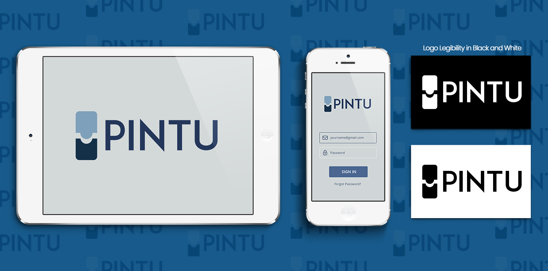
1.1 Pintu Branding
Project Cycle
My role was split into three phases:
Phase 1: Initial stages focused on ensuring that the information architecture was logical and effective in helping the client include all features respectively.
Phase 2: Once this was set, designs of web pages, assets, and iconography took place.
Phase 3: Iteration. Iteration. Iteration. Based on client and development team feedback, designs were iterated in regards to aesthetics and coding limitations. There were 3 main iterations.
Note: Due to my position, time, and resources, I was not able to conduct complete user research to widen my view on the user experience, so key principles and secondary source findings were used to inform design decisions.
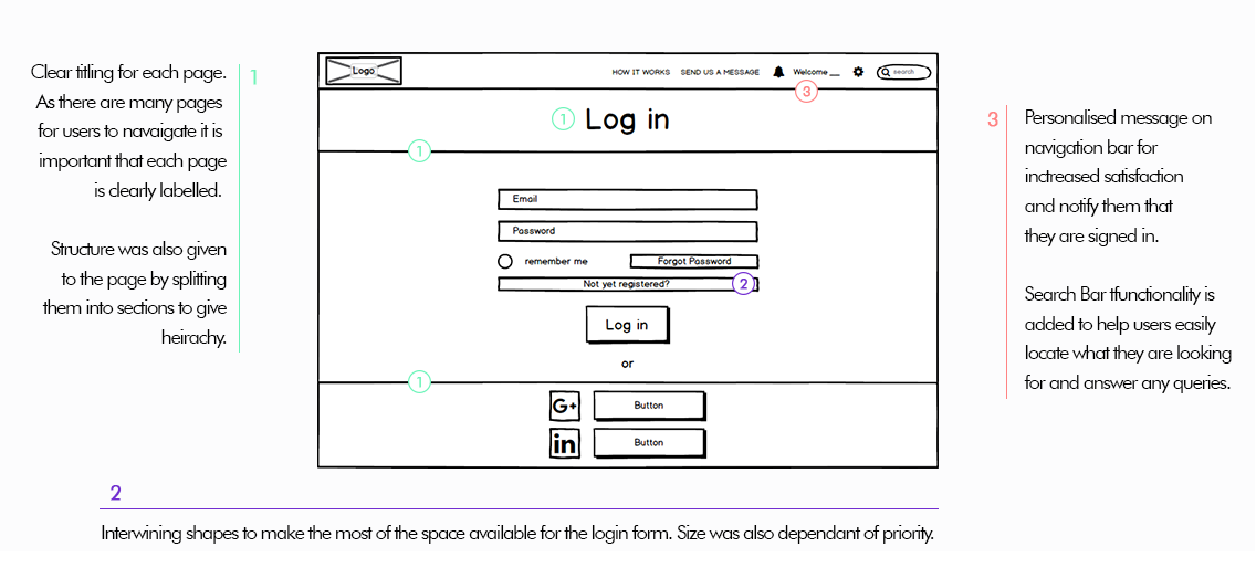
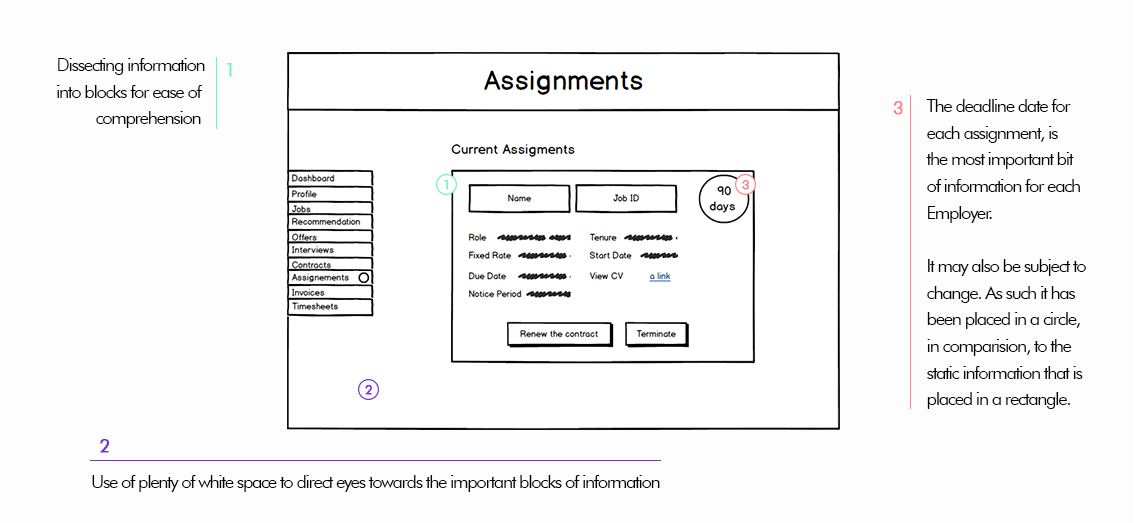
I used Balsamiq to create the wireframes as it allowed for rapid ideation and conveyed ideas clearly. The cartoonish design also allowed stakeholders to feel comfortable in criticising designs and suggest changes due to its incomplete exterior.
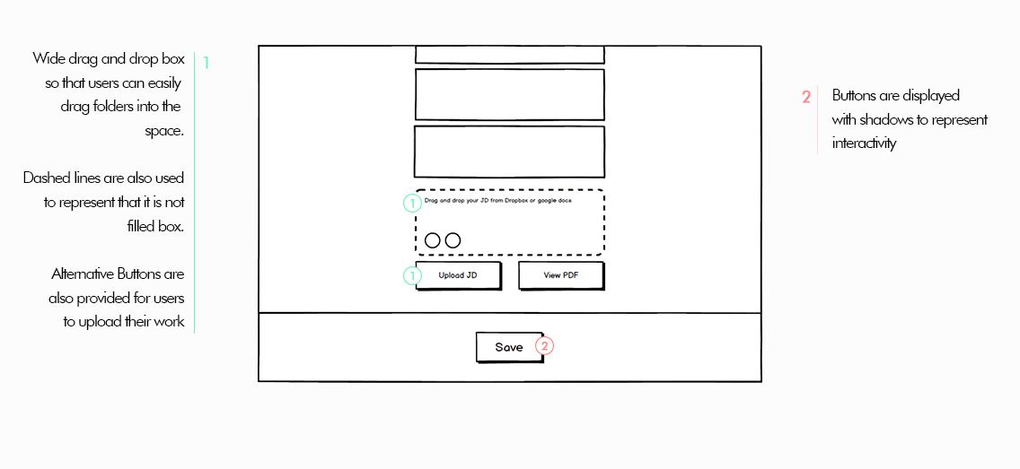
As this website required mass amounts of user input and data comprehension, I used visual hierarchy to allow information to be quickly extracted. The wire-frames focused on creating spacious designs to help reduce the feeling of clustering and over-saturation.
The UI followed a minimalist flat design. This allowed for creativity when designing a user interface that satisfied the clients brief of memorability and intertwining the branding onto the key elements of the site.
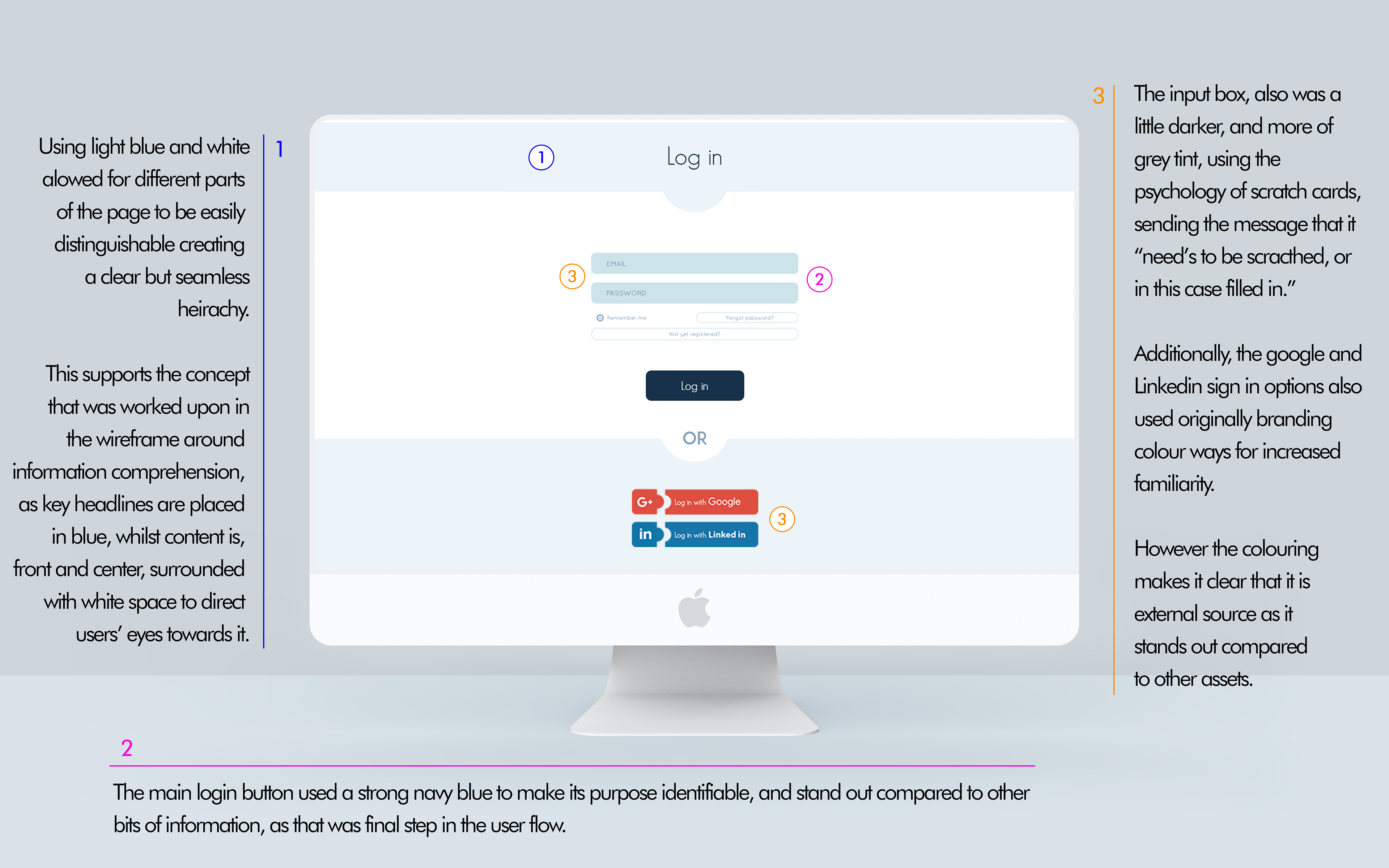
This helped achieve the brief of creating a memorable site that intertwined with the branding. Users were able to experience a unique looking site, whilst subconsciously linking the half circle design on each page with the brand. .
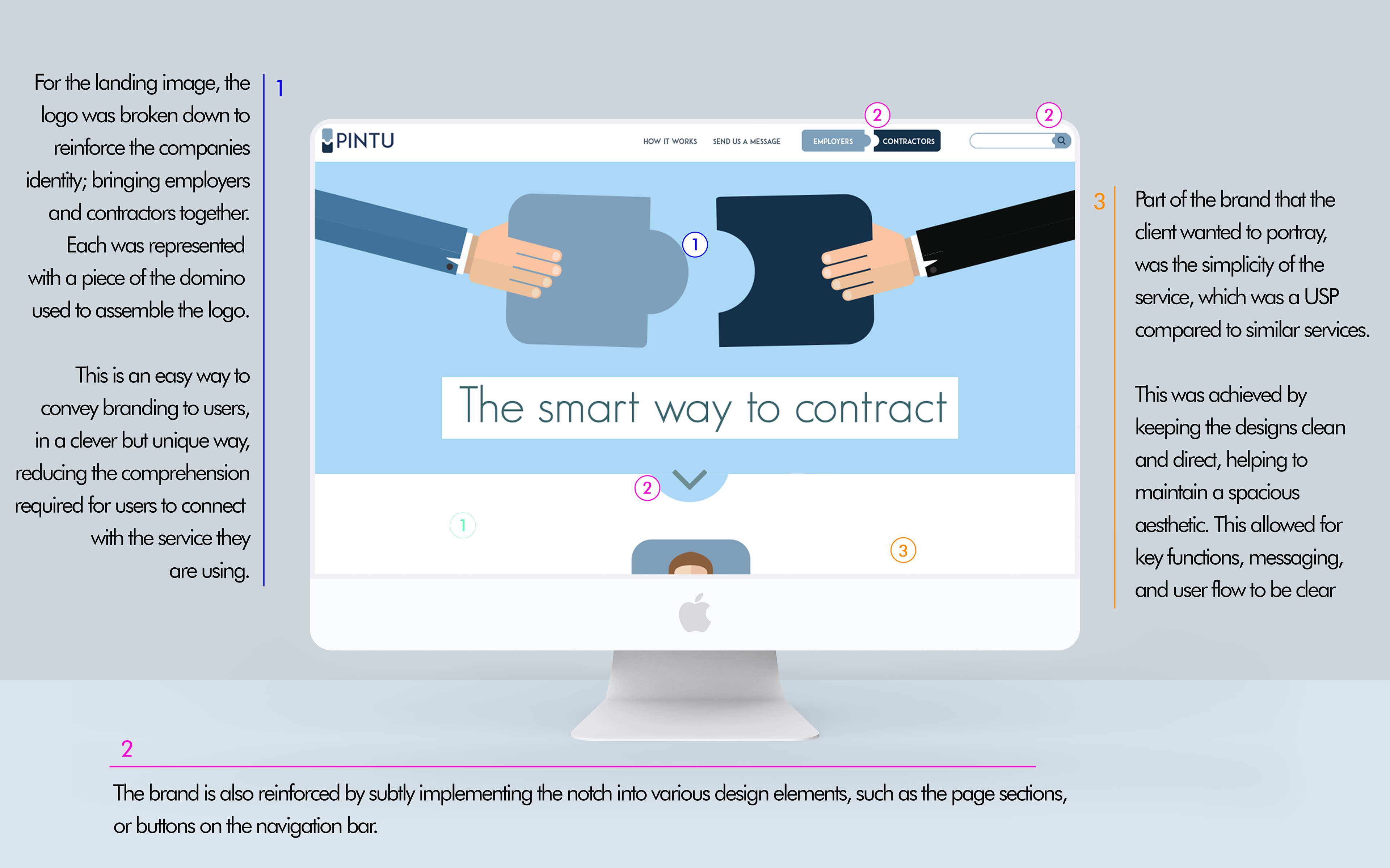
As the company's Logo was 2 domino pieces coming together to represent contractors and employees respectively, I decided to illustrate this idea on the landing page. Throughout the site, the idea of interconnected shapes was implemented in subtle but effective ways.
